The world is full of design classics. George Carwardine's anglepoise lamp. Harry Beck's tube map. That sofa that looks a bit like someone's mouth. And now we have the Australian cigarette packet.
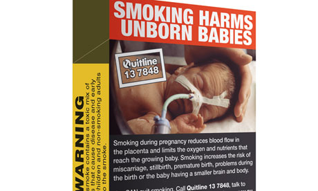
You might well know the one: no branding, massive picture of a baby hooked up to a ventilator on the front, loads of bold all-caps text words starkly reminding you of the role that cigarettes play in your inevitably reduced mortality. It really is a thing of beauty.
Or at least that's what the Design Museum thinks. It has shortlisted for a Design of the Year award, alongside Clapham Library and something called the Donky bike. If you're Australian, you will have seen the packets – by law, all cigarettes sold there since last year must be packaged in unbranded boxes covered with anti-smoking messages.
The design has made the shortlist because it's so unappealing. Market research showed that olive green was the least attractive colour to shoppers, the imagery is engineered to be offputting and, unless you like being reminded of what a monster you are in large sans‑serif block capitals, you probably won't go crazy for the text. It is purposefully ugly and hits its brief perfectly.

